Guest post by: Sara Gonzalez
If you've read my previous post, you will have heard of my on-boarding experience into the company. Two weeks in and it’s still an uphill journey but the incline is gradually becoming a little less steep.
It’s an interesting thing, diving into a new area of design. Dieter Rams, industrial designer from Germany really hit the nail on the head with his quote for documentary Objectified. His 10 commandments of design beautifully encompass objectives that can be applied across all areas and mediums.
“Good design should be innovative, should make the product useful, is aesthetic, makes the product understandable, is honest, unobtrusive, long-lived, consistent in every detail, is environmentally friendly and last but not least, good design is as little design as possible.”
How and with what you achieve these goals is dependent largely on the medium of a design.
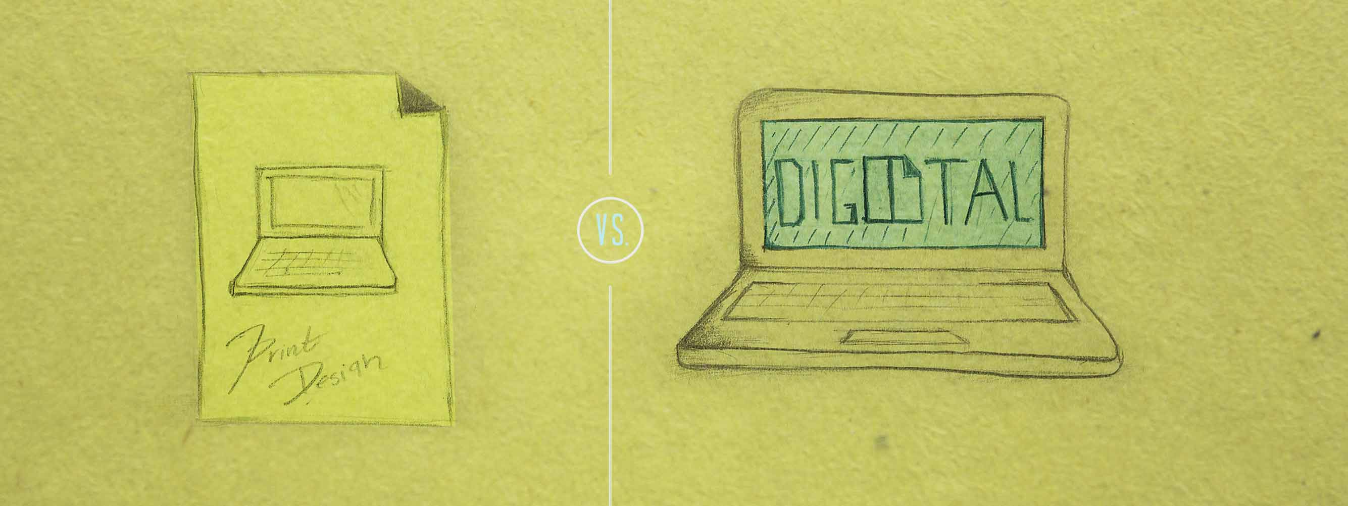
Being a digital marketing agency, you can probably imagine how much grief I get around the office with my background being primarily in print design. Everyone is pretty straightforward.
Like I’ve mentioned before our company maintains an agile communication atmosphere, meaning that no one wastes time beating around any bushes in the process of cross training.
Co-founder Nathan Villarreal told me straight out that I would need to “empty my cup” referring to common design habits that primarily applied only to print. Four years of design experience swept right out from under my feet.
Of course there was some resistance, but all that was left at that point was to pick and choose the pieces of my design expertise that did apply to digital and web design, and quickly catch up on everything else.
![]()
Print Tendencies
If there’s one thing I love about working at Bridge, it’s the creativity that goes into coming up with metaphors used to get one’s points across. Co-Founder Joshua Villarreal was quick on his feet to say that
“No matter how much improvements you make to a Volvo, it could never be a Ferrari. However if a Ferrari was covered in mud it would still be a Ferrari ”
He was ultimately trying to explain that a design should be good, work & be functional without unnecessary embellishments and that we should always be aiming to create the equal value of a “Ferrari” even from the initial stages of a project.
To put Josh’s quote into better context, the topic actually came up when I was working on wireframes for a website. One habit that was clearly being carried across my work was the increase of kerning (white space in-between each letter) to increase legibility and make better use of space in a certain area.
This method is perfectly acceptable in print design. However in web design, kerning can prove to be a much more difficult and tedious task during the development phase, and especially time consuming when dealing with responsive web design.
As you can see it would not be beneficial to spend that much time to add a design effect that would not necessarily make a huge difference in the quality of the over all design.
Changing the way you think.
Gestalt theory was at the foundation of every design decision I ever made right out of my graphic design program. The German word “Gestalt literally translated to shape.
The central principle of Gestalt psychology is that the mind forms a global whole with self-organizing tendencies. These “tendencies ” are the elements and principles of design that are explained in every graphic book ever made.
For a long time now I relied on pre-established elements and principles constantly mentioned in books, and this served as a great foundation to when explaining print layouts and the use of certain design patterns but digital design has various other factors and are so much more involved.
Designers have to really be thorough in researching how their design is going to be used and implemented. You are no longer planning for a static medium. The success of a digital design is heavily reliant on content structure, analysis, testing, ease and simplicity.
The mediums we are designing for are changing so rapidly that designers now are learning as they go. More than learning, we are shaping and influencing how people interact with these new devices and platforms.
Luckily with digital design it is now simpler to track the effectiveness a design. There are analytic tools to help track how well designs are performing among users.
One tool, for example is a heat map, what this does is track the users eye movement, identifying which parts of a screen or design the user is primarily focused on or attracted to.
You can see how this can prove to be extremely useful for designers when making decisions regarding placement of important information or graphics. Ultimately this helps improve information architecture and user experience.
The Ever Glorified Creative Process
People seem to write about their love/hate relationship with the creative process, what worked for them and how they “get” creative. None really directly apply to digital design; most are kept pretty general so that they can apply to any number of areas regarding creativity.
I myself admit getting sucked into reading such articles and studies that describe the process and how certain actions effect the generation of ideas.
One particular favorite was an article describing the effects and roles that of alcohol & coffee play in the creative process. To summarize the article suggested that beer would be taken first to get the juices flowing in the concepting stage.
Coffee would be most effective in the editing process where you are required to focus on goals and parameters that require you to think objectively, make logical decisions and finalize a direction.
Start up life doesn’t allow for large chunks of time to bask in one’s intoxication, spending several joyous hours prowling every corner of your mind in hopes of arriving at an enlightened conclusion. Nor did it lend well to the idea of spending $300 a month to satisfy my sweet, sweet craving of my triple shot soy hazelnut lattes.
Of course this doesn’t mean there is no creative freedom involved; in fact I would argue that there is more creativity required. With great restrictions, comes great opportunity. The more restrictions and parameters put in place, the more a designer will be forced into corners and develop stronger critical thinking skills and creative problem solving skills.
After developing a general outline for the goals of each interface, a content strategy is formed. This involves the designer really getting into the mindset of a user and creating content that speaks to the user clearly and establishes a voice for the brand.
Content should be structured in a way that best drives the user to the end goal of the interface. One of the most common mistakes made in print design is relying on customer provided content.
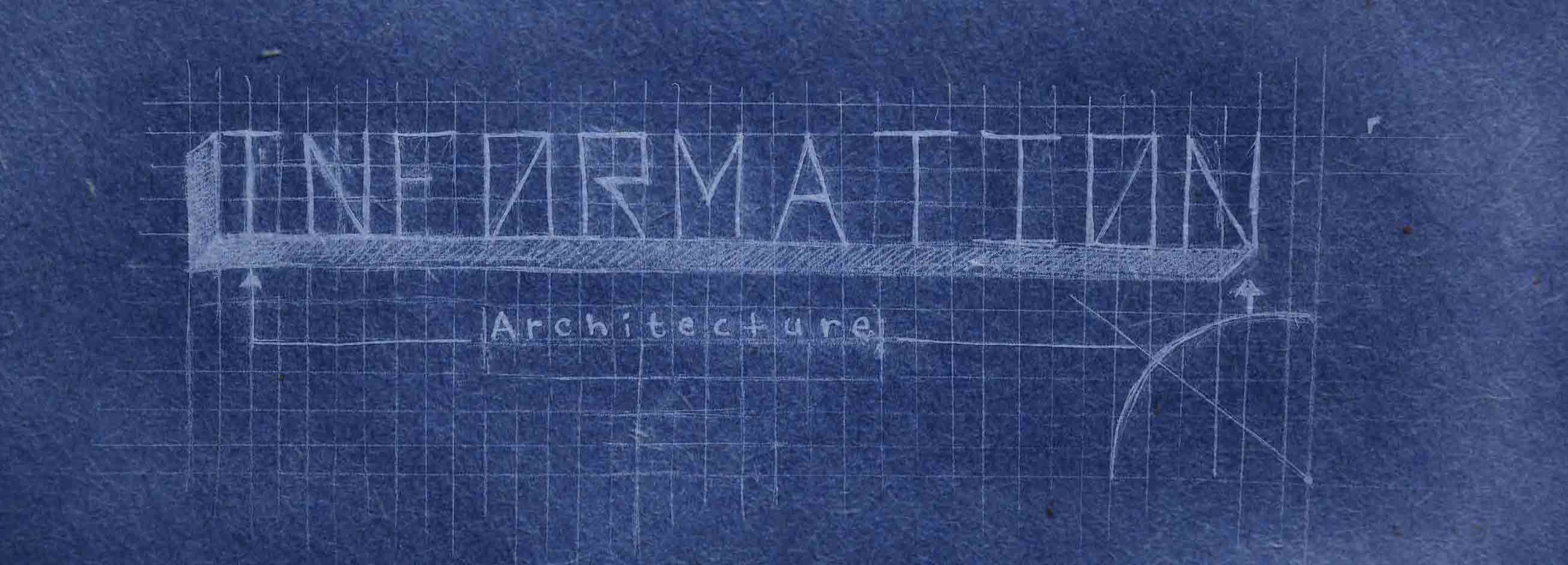
Content strategy and information architecture are the foundation of effective web design. The foundation must complete and strong in order to move forward with the process and build upon it.
Just in case you’re wondering where this designer now get’s her caffeine intake from, well that would be the magical drink that is Xenergy. It keeps me focused, alert and doesn’t burn a huge hole in my pocket.